Our Style
Advice
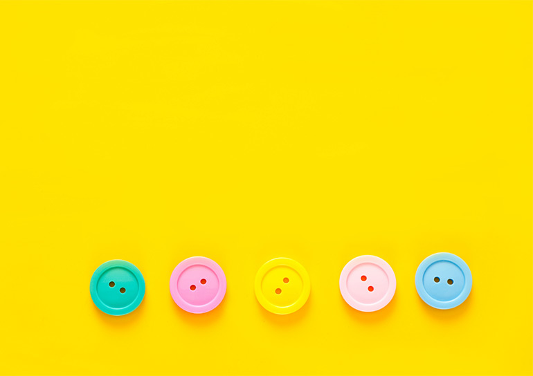
Colour Guides
Colour is individual, natural, magnetic, influential, emotional, therapeutic and joyful and the emotions it stirs are a vital part of a woman’s beauty and charm.
Read
Shape Guides
The clothes which will flatter you best will depend on your body shape. Today the choice of clothes is so varied that there’s something for everyone.
Read
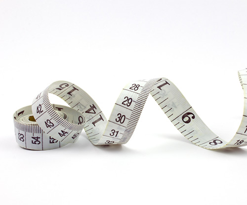
Measurement Guides
The following guidelines should help you to measure yourself in order to find your perfect size in the UK or when buying an international label.
Read
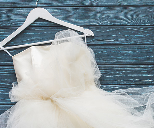
Wedding Style
We have advice on your all important wedding dress, from finding the right one for your body shape to the famous dresses in history.
Read
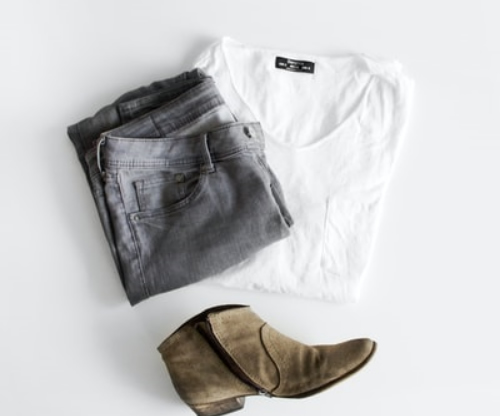
Clothes Guides
Read
This might interest you

Free Course
10 tips for a Happier You. Happier Planet.
Inside you will learn simple but life-changing tips to help you and the planet be happier. sign up now and receive your free tips.
Brand Directory
See our directory of sustainable fashion brands
Our aim is to make it easier for you to find the brands which are trying to adopt sustainable fashion practices and share your love of the planet and other animals.
